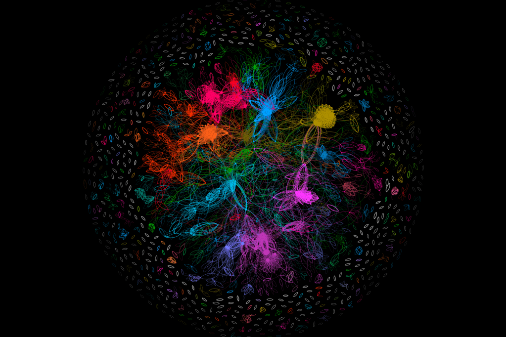
This is an old video, but still relevant. A lot of folks have asked me how I create beautiful graph visualizations. This video walks through the process step-by-step. I’m using a free tool called Gephi that can be downloaded from gephi.org.
If you’re more of a python coder, or want to generate beautiful graphs like this programatically, or without the use of a UI tool, check out my graph_simulations github repo: https://github.com/r0zetta/graph_simulations
The repo contains code to create Gephi-like visualizations, animated videos of time series graph transitions, and a library to generate graphs to spec, based upon your own custom variables. It also includes code to simulate a couple of pseudo-real-world simulations as a starting point for your own research. Models designed to track and predict COVID spread were modelled in this way.


Leave a comment